You are using an out of date browser. It may not display this or other websites correctly.
You should upgrade or use an alternative browser.
You should upgrade or use an alternative browser.
Melbourne Rebels 2011
- Thread starter RugbyFuture
- Start date
- Status
- Not open for further replies.
RugbyFuture
Lord Logo
no way, for one its ugly, for two they're direct enemies, none of my jerseys (other than tahs, eastwood and wallabies) are within the shute shield, super 14 or top 10 nations (other than fiji, tonga and samoa, they're jerseys are just too awesome to ignore)
M
Mehrts
Guest
I have been looking foward to this day for so long ") , i am 17 so therefore do i buy a junior membership or a concession ?
, i am 17 so therefore do i buy a junior membership or a concession ?
, i am 17 so therefore do i buy a junior membership or a concession ?
T
TOCC
Guest
A lot of people this was a shit looking jersey at first as well, but i think the look of it grew on most people...

Like mentioned already, once the sponsors are on there with a bit of extra color, and they players wear correctly fitting jerseys it wont look so bad
Like mentioned already, once the sponsors are on there with a bit of extra color, and they players wear correctly fitting jerseys it wont look so bad
A
alexfaure
Guest
They seem to have not gone with the Vic history which is dark blue and white hoops or dark blue with a thumping big V.
im very dissapointed with the shirt design. look at the state side Vic 1 and Vic 2 jearsey are seiously cool, they are awesome. so why dont they design something on those lines. no design something that people might be worried to wear out in public
Baldric
Jim Clark (26)
Those jumpers were puke. The Vic III jumper rocked.im very dissapointed with the shirt design. look at the state side Vic 1 and Vic 2 jearsey are seiously cool, they are awesome. so why dont they design something on those lines. no design something that people might be worried to wear out in public
A
alexfaure
Guest
Those jumpers were puke. The Vic III jumper rocked.
nahh there not. those jumpers symbolies victorian sport. just look at like the Victorian football gmes, and even melbourne victory, they both showcase the big v. It would be a shame that the designer to remove this, i truely hope that they change it. Also the VIC III's jumper was okay, i liked the hoops, but the didnt like hope the back part mixed with it, wasnt my favourite
wobbly
Fred Wood (13)
Fuck I hoped the kit would be better than that. I'm not buying it. Take away the stars and it's a dodgy looking French strip.
Won't someone please bring back proper collars
Memberships are too high compared to League and AFL. They need to have a 4 game membership offer as well, like many of the AFL clubs have. Trying to price like the stinking Tahs. Melbourne is a much more competitive marketplace and smarter marketing is required to build a supporter base.
C
CanadianRugby
Guest
As a rugby shirt collector who rivals RF in numbers that I have (modesty forbids me from saying how many), I have decided that I'm just waiting for the next one that they will make next year. Give them some time to improve them. Maybe they can go the Stade Francais route and completely change it every year. But the stars down the middle have to go.
Langthorne
Phil Hardcastle (33)
That jersey sucks arse. Those stars are an abomination..and they've gone with blue! There were so many potential colours and patterns and they've come up with...that! Who is the designer? Looks like the work of a committee.
Equally vomit inducing is the:
Retarded
Excruciating
Bilious
Exasperating
Loathsome
Sad
little motto.
I was getting all excited about this new team with the legend manager, now I'm just a little concerned. Hopefully this is not a glimpse of things to come.
Equally vomit inducing is the:
Retarded
Excruciating
Bilious
Exasperating
Loathsome
Sad
little motto.
I was getting all excited about this new team with the legend manager, now I'm just a little concerned. Hopefully this is not a glimpse of things to come.
stoff
Trevor Allan (34)
The Rebels have re-launched their website at http://www.melbournerebels.com.au
Also, a better shot of the whole uniform here: http://www.theage.com.au/rugby-union/union-news/fivestar-rebels-aim-to-be-out-in-force-20100729-10y00.html
Also, a better shot of the whole uniform here: http://www.theage.com.au/rugby-union/union-news/fivestar-rebels-aim-to-be-out-in-force-20100729-10y00.html
Reddy!
Bob Davidson (42)
Would have been nice if the jersey had a bit more traditional rugby flair about it - like stripes or hoops around the torso in navy and red with a White V cut into it.
Even this jersey of Melbourne FC (one of the oldest, if not the oldest, football club in the world) has reference to the V in their design and the colours I mentioned. Subtle but effective and certainly is a recognisable jersey even if you don't follow AFL. Unless the Rebels start winning from word go, it will be difficult to create a brand with a jersey as unmemorable as theirs.
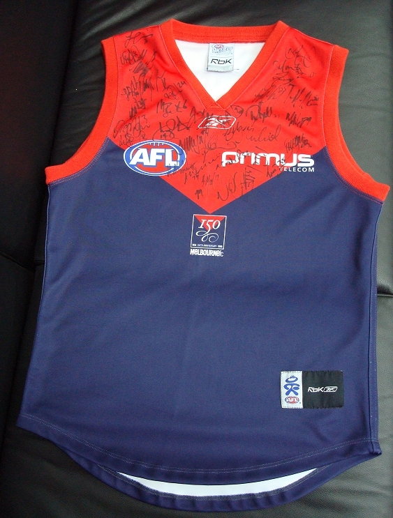
Even this jersey of Melbourne FC (one of the oldest, if not the oldest, football club in the world) has reference to the V in their design and the colours I mentioned. Subtle but effective and certainly is a recognisable jersey even if you don't follow AFL. Unless the Rebels start winning from word go, it will be difficult to create a brand with a jersey as unmemorable as theirs.
- Status
- Not open for further replies.