• Welcome to the forums of Green & Gold Rugby.
    We have recently made some changes to the amount of discussions boards on the forum.
    Over the coming months we will continue to make more changes to make the forum more user friendly for all to use.
    Thanks, Admin.

World Cup Jerseys 2011

Status
Not open for further replies.

RugbyFuture

Lord Logo
someone please get me in touch with the jersey manufacturers and their respective contacts at the unions, I need to inject some taste into their offices.
 

Nelse

Chris McKivat (8)
That dark scot jersey has to be a training one. I mean black and gold? (at least thats what it appears to be on my work monitor) can't they just stick with the purple and white?
 
U

Utility Back

Guest
Love it (her) brave heart, also, wallabies jersey will look a tonne better without the sponsor logos all over it!!
 

Groucho

Greg Davis (50)
I like all the new jerseys except for the Ireland one, which is inept. People get so angry about change. Collars and the lack thereof is a particular sticking point. At the end of the day it is all just sports equipment.
 

Slim 293

Stirling Mortlock (74)
I like all the new jerseys except for the Ireland one, which is inept. People get so angry about change. Collars and the lack thereof is a particular sticking point. At the end of the day it is all just sports equipment.

I agree with you in regards to the style of jerseys these days and their lack of 'collars' or whatever...

But I think the only thing letting them down at the moment is the designs, which could be better...

I know I've already mentioned it twice but the overall French kit for the past couple of years was great, but they've ruined it with this new one...

By the way, here's the proper Ireland RWC kit:

index.php
 

Rob42

Nicholas Shehadie (39)
Don't worry, we can only be a season or two away from when some S15 or national team comes up with a proper jersey with a collar and is lauded for their "marketing genius", in giving the fans what they want.
 

RugbyFuture

Lord Logo
well if you think its just "sports equipment" look at the AFL and NRL and NFL and MLB and NHL and NBL......

Its not about "just" being "sports equipment" its about the look of the sport, what that sport means to its fans, being able to show off the sport to others. That look is developed oover the years in ther garments the sportsman wears when playing.

a collar and none of this subtle sublimated "grip pad" shit and its all fine. Doesnt even have to be a real collar, the priest collars are by far the best collar to have. thats all they need.
 

Scarfman

Knitter of the Scarf
Man, there are some excrescences there already. What would you say to the guy who decided that Ireland needed a jersey with hexagons and a rugby ball on it. You might just pop him one on snout. God knows what Georgia will come up with.
 

Swarley

Bob Loudon (25)
Wallabies RWC2011- Home & Away Jerseys

Home:
IMG_8934.JPG


Away (Biggest picture I could find):
223123-white-jersey.jpg


Home & Away:
142247-wallabies-jersey.jpg


I really, really hope they don't wear that abomination of an alternate strip. I honestly think a better alternative would be like the Socceroos, going all blue with yellow trim (see bottom of the page). I also don't understand the need for so much green piping. Have some down the sides and near the sleeves, but it doesn't need to look like a jigsaw puzzle.

Socceroos Alternate Strip:
Socceroos%20Away%201012.jpg
 

The_Brown_Hornet

John Eales (66)
I don't mind the Wobs strip too much, though I prefer the circa 2006 model with the green side panels. Some of those other ones are utter dreck, however. The French strip is the biggest abomination. It's a shame they are no longer with Adidas, because they could still be wearing this...

serge_blanco87_270.jpg
 

AngrySeahorse

Peter Sullivan (51)
At least they don't have a bra:

http://a8.sphotos.AK (Andrew Kellaway).fbcdn.net/hphotos-AK (Andrew Kellaway)-snc6/269154_10150689478380557_518940556_19598765_6780715_n.jpg

Oh FFS WTF is going on!?

The other Eire jersey is a little better but the green is too dark. Just give me this one below.

vintage-ireland-rugby-shirt-%5B2%5D-459-p.jpg
 

Slim 293

Stirling Mortlock (74)
Man, there are some excrescences there already. What would you say to the guy who decided that Ireland needed a jersey with hexagons and a rugby ball on it. You might just pop him one on snout. God knows what Georgia will come up with.

Georgia have gone the simple and classy route:

z17989.jpg


Basic alternate strip:

KooGa-Georgia-Shirt-Away-RWC-2011.jpg
 

RugbyFuture

Lord Logo
georgia should have gone with a similar design as 03. too many people bought them and never woar them. bastards. never got my hand on a copy. havent seen one since.

of course it would have to be in post revolutionary colours....
 

grievous

Johnnie Wallace (23)
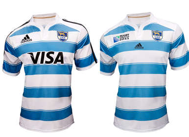
Argentina carrying the torch for simple, traditional designs:
Argentina-rugby-shirt-2011.jpg

Notice how IRB let only the smallest of signs of the manufacturer from the first to the second jersey, why, the adidias stripes adds to the design and stops all the teams having the same bland designs
 
Status
Not open for further replies.
Top