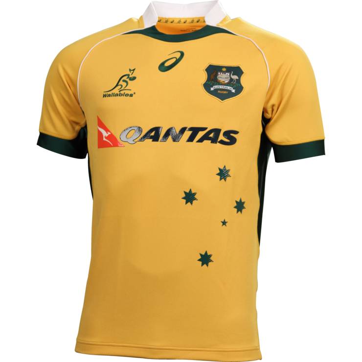
I can understand how a person could not be crazy about it, but for fucks sake there's subtle touches of green and a southern cross which dates back to the Canterbury jerseys.
Do you fucking work for Kooga/BLK or something Tahdan? It looks better and simpler than the 2006 and 2007 Canterbury jerseys.
Why the fuck would I have to be working for BLK to find this thing repulsive?
I just reckon there's way too much shit on this and it fucks up the whole look of the jersey.
I mean, if you're gonna do a collar that tries to hark back to the old white ones with green trimmings, then actually fucking do it! Don't have some weird half arsed shit with a random green blob in the middle. It just makes it look shit.
And yeah, the SC has been around since the CCC days, but only for a brief period really and it always made the jersey look a little busy.
Seriously, what pisses me off most of all is that the ASICS Springbok jersey rocks. It's classic, simple and elegant. Why couldn't they use that as the basis for the wallaby design? It's like they think we've all god ADD and so piled crap into it.


